
Contractor website design Florida often gets pushed to the bottom of the list. You are out quoting jobs, managing crews, dealing with suppliers and driving between sites. The website is “something we set up a while ago” or “whatever the last guy built.”
The problem is that for many homeowners and property managers, your website is the first impression. If it is confusing, outdated or slow, they may never call—even if you are the best contractor in the area.
The good news: contractor website design in Florida does not have to be fancy or expensive. It just needs to be clear, fast and easy to contact you.
Here are 5 costly mistakes Florida contractors often make on their websites, and how to fix each one with practical changes.
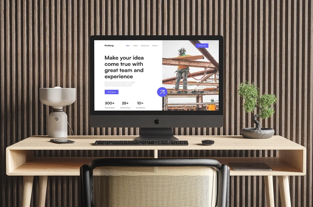
Mistake 1 – No Clear Headline Explaining What You Do
The problem
A lot of contractor sites open with:
- A big photo and no text
- A vague slogan like “Building your dreams”
- Just a company name with no context
If a visitor has to scroll or guess to figure out:
- What you actually do
- Where you work
- Who you serve
you are already losing people.
The fix: One clear sentence above the fold
At the top of your homepage, you need a headline that answers three questions:
- What you do
- For whom
- Where (rough area)
For example:
- “Kitchen and bathroom remodeling for homeowners in Central Florida.”
- “Painting and pressure washing for homes and businesses in South Florida.”
- “Custom cabinetry and built-ins for residential projects in Orlando and nearby areas.”
Under that, add a short subline, such as:
“Licensed contractor, 10+ years of experience, detailed estimates and clean job sites.”
Search engines and users both respond well to clear, descriptive headings. If you want more background, Google’s own SEO Starter Guide has a section on writing descriptive page titles and headings.
Mistake 2 – No Real Photos of Your Work
The problem
Many contractor websites rely almost entirely on stock photos:
- Perfect showrooms you did not build
- Random “construction” images
- People in safety gear that are clearly not your crew
Meanwhile, your real work is sitting in your phone gallery.
When a potential client sees only stock:
- They may wonder if you are new or inexperienced
- They do not see the type of projects you actually do
- They cannot easily compare you to other local contractors
The fix: A simple, honest project gallery
You do not need a massive portfolio system. You need evidence.
Create a “Projects” or “Our Work” section with:
- 8–20 real project photos (even if the lighting is not perfect)
- Before/after pairs if you have them
- Short captions like:
- “Kitchen remodel – Orlando, FL”
- “Exterior repaint – Kissimmee, FL”
- “Condo bathroom update – Miami, FL”
Basic image quality matters, but authenticity matters more. For general tips on preparing images for the web (sizes, compression, formats), Google’s image SEO best practices are a useful reference.
Mistake 3 – No Obvious Way to Contact You
The problem
Some contractor sites make it surprisingly hard to reach the business:
- Phone number only on a “Contact” page
- No email address visible
- Contact form hidden or broken
- No clear “next step” call-to-action
If someone has to hunt for how to contact you, many will simply leave and call the next contractor with a clearer site.
The fix: Make contact stupidly easy
For effective contractor website design Florida, your site should make contact almost unavoidable:
- Phone and main call-to-action in the header:
- “Call Now: (XXX) XXX-XXXX”
- Button: “Request a Quote”
- A simple contact form on the Contact page and/or near the bottom of your homepage: Recommended fields:
- Name
- Phone
- City / area
- Type of project
- Short description
You can always ask for more details later. The goal is to make that first step frictionless.
If you are using forms, remember basic privacy expectations. Many small businesses review guides from resources like the FTC’s basics for small business privacy and data security to stay aware of best practices.
Mistake 4 – Slow, Cluttered Pages
The problem
Some contractor sites are:
- Slow to load, especially on mobile
- Packed with animations and sliders
- Filled with long, unstructured text
Visitors in Florida are often checking sites on their phones, on cellular data, between tasks. If your pages take too long to load or feel heavy, they bail.
The fix: Simplify layout and optimize images
A lean, effective contractor homepage might include:
- Hero section – clear headline, short subline, primary service area, main CTA
- Services overview – 3–6 cards explaining what you do
- Project photos – a small gallery of recent work
- About – who you are and why you’re credible
- Testimonials – a few short quotes
- Contact section – form, phone, service areas
To improve speed:
- Compress and resize images before uploading (no 8MB photos straight from your phone)
- Limit the number of sliders, carousels and heavy scripts
- Use a performance-friendly theme or builder and a caching plugin
If you want more technical guidance, Google’s PageSpeed Insights lets you test a page and see specific suggestions. KUBO can help you interpret those and apply the ones that matter most for your site.
Mistake 5 – Outdated Branding and Mixed Styles
The problem
Even if your content is decent, mixed branding can make your business feel disorganized:
- Old logo in the header, new logo on trucks
- Different colors and fonts on each page
- Estimates and invoices that do not match the website
This creates a “patched together” feel and quietly hurts trust.
The fix: Align the site to your current brand
You do not need a complete rebrand to clean this up. Start by deciding:
- One logo to use going forward
- One color palette (primary, neutral, accent)
- One pair of fonts (headline + body)
Then:
- Update your website header, footer and buttons to match
- Replace obviously outdated graphics
- Refresh key PDF templates (estimates, invoices) with the same look
From there, you can keep tightening consistency over time—yard signs, social posts and any printed materials.
If your current logo and colors are very dated or inconsistent, that is often the point where a Starter Branding Kit from a design studio like KUBO becomes the better first move. Once the brand is cleaned up, the website redesign becomes much faster and more straightforward.
How KUBO Approaches Contractor Website Design in Florida
At KUBO DESIGN.LAB, contractor website design Florida revolves around three priorities:
- Clarity
- Visitors quickly understand what you do, where you work and how to reach you.
- Proof
- Real projects, testimonials and simple explanations of your process.
- Leads
- Clear calls-to-action and forms that capture the right information without overwhelming people.
A typical Core Website Build for contractors includes:
- 1–5 core pages:
- Home
- About
- Services
- Projects / Gallery
- Contact
- Clean, brand-aligned design based on your logo and colors
- Responsive build (works on mobile, tablet and desktop)
- Basic on-page SEO structure (titles, headings, image alt text, sitemap)
You do not need complex features to start getting better results. You need a site that:
- Loads quickly
- Looks consistent with your trucks and materials
- Makes it easy to contact you
- Shows that you are active and legit
Not Sure Where to Start? Fix the Basics First
If your current site feels old or clunky and you’re not ready for a full rebuild, start with these steps:
- Update your homepage headline so it clearly states what you do and where.
- Add real project photos and captions to replace generic stock.
- Make sure your phone number, email and a simple form are easy to find.
- Remove broken sections, outdated widgets and obviously confusing elements.
- Align colors, fonts and logo with your current branding as much as you can.
These improvements alone can make your contractor website design Florida feel significantly more professional and trustworthy.
When you are ready to go further, a focused Core Website Build at KUBO can give you a clean, lead-ready site tailored to your business.